Your art is upper tier pro quality---sytlized and beautiful, your dialogue is solid, your characters are downright briliant, and your storyline is promising.
That said, with all due respect, I wouldn't buy this.
Here's my breakdown.
Panel 1 - I love it for the most part. Not sure why there is smoke rising from the chimney in a vampire's castle. That could be a mistake---or could be an excuse for humor.
Panel 2 - You start to lose me here. You don't capture anguish or outrage or even concern in this character. All I get from this is that he is pointing at himself. Is he over the top or is he subtle? Is he taking offense because he is a vampire or is he taking offense because he is a count and he isn't being listened to? His reaction would be different depending on that. Is he very showy in his high breeding? Either way, the panel demands more. Which ever take is the one the character demands his reaction is going to be more telling than what you have drawn. Good comic art conveys a story without words. without words in this panel would you have any clue this character was disraught?
Also, what is with the box in box panelling? I am a big fan of experimental panelling, but this doesn't seem to work right here. Maybe roughing up the interior edges somehow? Is it your intention to always show the vampire in a box in box? THe choice of black wording I like, less on board with it also being boxy. THe dialogue suggests it should be two word balloons. Two concepts there. The art doesn't allow for that, especially if you use word boxes instead of word baloons.
Panel 3 - I pretty much hate this panel. It is over the top and an overused artisitic shortcut in comics I don't like. The cartoony talking head.
To me, you cheat your reader here. This panel is an opportunity to introduce Karion with punch. Instead of showcaseing his uniqueness, you use him as an interchangeable talking head that could be any of your characters---as a foil to the baron and a launching board for light humor. When you introduce characters (IMO) you need to think, "what element of uniqueness does this character possess that I can use to hook my reader into wanting to know more about him?"
In a bad comic these initial panels are used to lauch a story. In a good comic each panel on the first page also hooks new readers. If you want to do comics you need to think about building and retaining readers.
Panel 4 - I pretty much hate this panel too. The opposing heads with opposing viewpoints with the arbitrar/leader in the middle. It is a frequently used shortcut to communicate that conflict between characters that is being smoothed out by another.
My questions to you are, 1) is it neccessary and 2) is it appropriate? Have you not already established that Karion and the Baron are in conflict about killing the vampire in residence in the previous two panels? I would say you have, making this shorthand overkill. This shortcut is a ton more effective when the conflict has not been previously established in the issue. Used as it is here, it is (again in my opinion) Hamfisted overkill.
With regards to the appropriate use question, again I would suggest this panel should be about grabbing the reader with the supercool nature of Dr. Chan. It is lost by choosing this panel (and page) layout.
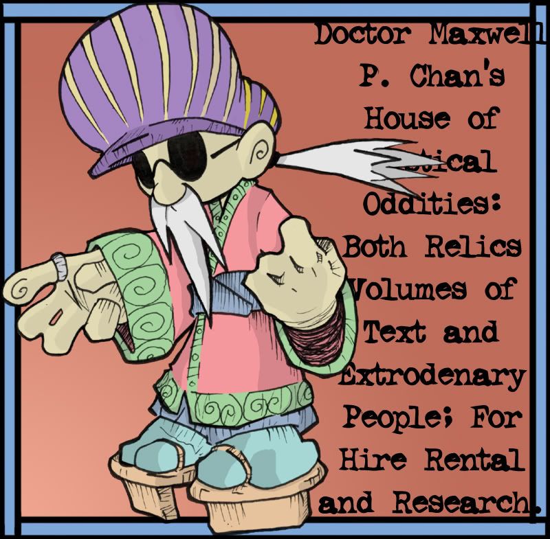
Additionally, I think Dr. Chan is too cutesy here. This page ooses smarmy cutesy in-jokes. I think if you want to really punch this book, you need to be more than a one trick pony. Why not hint to a side of Dr. Chan that is not all cutesy?
Frankly I think you might have had a much stronger intro panel with (another cliche shortcut) a backlit Dr. Chan. It would give authority and could be a funny moment unto itself when you turn the page and Chan walks into the light.
Also why does Dr. Chan's shovel have eyes? Cutesy and distracting. I hate that in combination. If you want his shovel to have eyes then be smart about it and don't show the reader until the shovel having eyes comes into play. As it is, it is just another annoying panel killer detracting from the characters.
Find the focus of your panel and show the reader that.
I hope I have not been too harsh. You have mad talent, but this one page totally UNSOLD me on your book. I hope my comments are useful in helping you really tap your talent and hitting it big.