Hey, haven't posted in a while, but I just finished the first page for a spooky little poem I'm working on. If it turns out good enough, I'll submit it to the anthology.
This looks like a very experimental piece. That doesn't mean it is bad, but you have to understand many of the critiques you will get here will be from the perspective of traditional superhero comic readers.
I think from a writing perspective most of the criticism already stated is pretty valid. I think you need to write your story/poem first. My cheif bitch with slice of life stories is that they go nowhere. When you take up a reader's time, IMO you owe the reader a payoff. If you don't deliver then a portion of your readership will tune you out.
I think this page suffers for the same reason.
Now I realize that this is just a single page, but the impression I get is that this is all there is. I wonder about some of the wording and the logical conclusion I reach is that you haven't tightened it up because you don't know where the story goes/ends.
(Now writers of the old movie serials would kind of take that approach, but they at least knew where this week's cliff hanger ended. Even if you don't know where this is going you should try to give the reader a reason to want to turn the page. You do a little with the door, but I'll discuss the art in a second.)
The wording has already been touched on. One of the biggest mistakes a beginning comic artist makes is not anticipating word placement. Where you place your word balloons, thought balloons, and narrative boxes is needs to be considered in the layout stage. You don't want your words competing with your art or covering/diminishing it.
Sometimes you can resize your art and create the space needed, but often the best approach is to redraw. For this reason, I strongly recommend thinking about placement in the layout stage; perhaps even printing out the word balloons first, putting them down on your board with scotchtape and drawing around them until you get the knack for anticipating what space will be needed.
(Don't feel bad about this--- a number of professional artists have the same weakness. They fall in love with their art and forget the storytelling aspect should be first and foremost.)
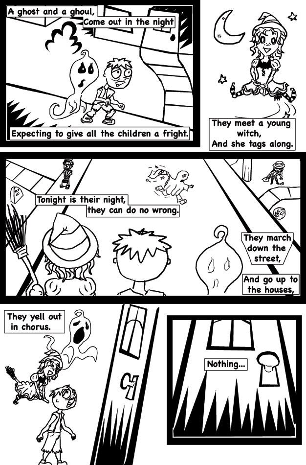
I love the bush in the first panel and your spikey shadows throughout, but panel placement compromises the shadows early on.
I do have a bitch about the first panel though. It is a little dry. It would be a ton stronger to have it take place in a graveyard and show a ghost seeping out of a grave and a ghoul climbing out of another. I frimly belief that good comic art tells a story without the script. Without your script, we don't know that the goul or the ghost are freshly escaped. Show us.
The borders need a little work. I am a big fan of bordered art, but frankly this is one page that might profit from a little border breaking. The witch panel might have been better overlaying another panel a bit. I really like the conceptual layout of the last two panels.
The thick black borders seem a little off. If you added those with photoshop or something, you might want to play with them a bit. Maybe you could hide the bottom of the first panel untder the top of middle border? I'd say play around with that a bit. Something else you might try is shading in the borders to create more black on the page. A lot of comic theory suggest a page should be about half black for it not to washout when printed. If you look at the last run of invaders you can see an art team totally run into the ground because their inker didn't follow that rule. With this type of story especially, you might cheat that a bit by blackening your borders.
I am not totally on board with the line weight critiques, as they suggest bringing your art in line with superhero art. Yes, putting your heaviest lines on the perimeter of your characters will make them "pop" properly, but this is not a typical comic story. Look at the work of Mary Fleener for inspiration. She is anything but typical and her art challenges most comic art logic, but it works in it's own right. Nothing to say yours can't.
That said, there are moments where you can see where that is a valid criticism. The middle panel for one. I suspect you don't like drawing the details of the sidewalk running into the street. No one does. You never want your reader to lose interest in your story and pull back the curtain and think, "the artist lost interest in drawing this panel."
You get away with the line sidewalks in your other panels, but in this one, you probably do need to add a little more detail to the curb and sidewalk rather than just a thick line. In essence it flattens your image. In addition your ghost's eyes are distracting in this panel because the line weight is off.
You use motion lines when you bring in the witch, but not in the fouth panel. To me, that is part of why your pages seems a little frozen. The problem is in that panel you have your ghost and your witch moving in almost the exact same direction. If you added motion lines it wouldn't look right. If it were me, I'd either redraw the whole thing, or do the more apparent quick and easy fix --- white out the ghost and redraw him in a slightly different pose moving in a slightly different direction. It seems like a witch is a person being propelled in a certain direction. A ghost is an insubstantial wisp seeping through the air in a fixed direction at improbable speeds. They probably shouldn't move the same way.
You may also consider having your ghost's size vary a little. or not. Just an idea.
This is very promising. Keep at it.


