|
|
Post by vanessa on Sept 3, 2006 2:45:36 GMT -5
Hey, haven't posted in a while, but I just finished the first page for a spooky little poem I'm working on. If it turns out good enough, I'll submit it to the anthology. 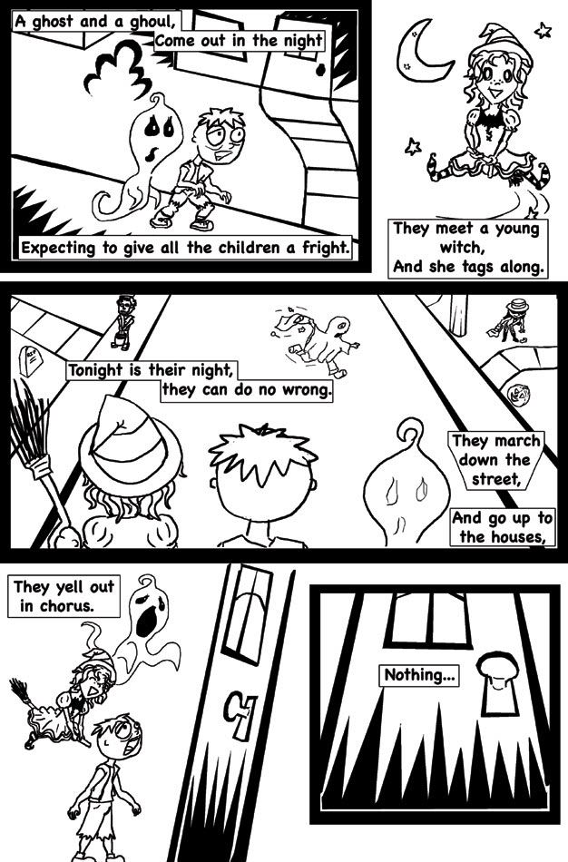 |
|
|
|
Post by mikem on Sept 3, 2006 11:36:14 GMT -5
Hey, haven't posted in a while, but I just finished the first page for a spooky little poem I'm working on. If it turns out good enough, I'll submit it to the anthology. Its good, but there's something about how the lettering is placed that makes it feel like the lettering and the art is competing. |
|
|
|
Post by vanessa on Sept 3, 2006 11:50:29 GMT -5
Hmm... yeah. I'll try playing around with the positioning of the lettering. It could probably be a size smaller as well.
|
|
|
|
Post by nolan on Sept 3, 2006 15:16:13 GMT -5
Nessa,
I really like the storytelling on this. However, i would like to see some more action of some kind. It seems more like a series of static images.
I agree with Mike's comments about the lettering as well. I think theres a way that you could do it far more effectively.
|
|
|
|
Post by berlinpoe on Sept 4, 2006 22:21:56 GMT -5
I think there are some fundamentals missing here. And by think I mean know.
The backgrounds need work, but before that the characters need more work. The poem, well I'm not really sure I LIKE it, but I'm not going to be mean to it based on my perferances. Color might help, but there are a lot of things missing. Sense of depth is a major one. Mainly in panel one. I like the door in the last panel...but it's just a door...and that's my favorite part...Panel three and one suffer the most from this lack of depth. How to fix it?
Line weights! If you are inking use a many differant thicknesses of pen. I would use a nib for this, it being creepy and all. I also have issues with character design in general, but it's mostly about it feeling a little cliche.
I think some hard drawing classes need to be in your future, you have the will now go out and grab the way...
Also, this critique in no way is a retort to your post on my Still Born Sisters page...I just havn't gotten around to critiquing this yet...
|
|
|
|
Post by mikem on Sept 5, 2006 10:16:07 GMT -5
I think there are some fundamentals missing here. And by think I mean know. The backgrounds need work, but before that the characters need more work. The poem, well I'm not really sure I LIKE it, but I'm not going to be mean to it based on my perferances. Color might help, but there are a lot of things missing. Sense of depth is a major one. Mainly in panel one. I like the door in the last panel...but it's just a door...and that's my favorite part...Panel three and one suffer the most from this lack of depth. How to fix it? Line weights! If you are inking use a many differant thicknesses of pen. I would use a nib for this, it being creepy and all. I also have issues with character design in general, but it's mostly about it feeling a little cliche. I think some hard drawing classes need to be in your future, you have the will now go out and grab the way... Also, this critique in no way is a retort to your post on my Still Born Sisters page...I just havn't gotten around to critiquing this yet... I disagree for the most part, because its a comic strip style thing. Some variation with lines wouldn't hurt, but I don't see that as a major problem at all. |
|
|
|
Post by nolan on Sept 5, 2006 15:25:23 GMT -5
I'm with mikem on this one.
However, I would like to see a little more in the way of some kind of action.
|
|
|
|
Post by berlinpoe on Sept 5, 2006 19:58:00 GMT -5
Guys, I like you. Really. But tell someone everything is okay, when it clearly is not is no more helpful than pointing out how horrible something is.
That this comic to an art teacher or profesional and ask them what is wrong with it.
Tell me this people won't disagree.
Sorry, guys but being nice needs to go along with being honest.
Vanessa, truely, this needs miles of work. But don't get discuraged. Everyone starts here. If this is some kind of style choice, please show me artwork that proves you know the fundamentals.
Abstact art NEEDS to be so obvious that no one would despute their talent. This doesn't do that. Either make it flater and more abstract, or start over.
Again, this isn't to be mean. There a lot of good things. The blacks are solid and the character designs are adequate but not astounding. Look, fundamentals, thick lines push items forward. She's using thick lines in the background, forcing the eye off the main focus.
Look this isn't to be mean it's a fact. If this is a style make it look like a style and not lack of talent.
-BP
|
|
|
|
Post by davidaccampo on Sept 6, 2006 0:24:59 GMT -5
Guys, I like you. Really. But tell someone everything is okay, when it clearly is not is no more helpful than pointing out how horrible something is. Just a note here. I think that you have good criticisms after this point, BP, but this first (quoted) comment presumes that you KNOW what everyone else here is REALLY thinking. That seems a little bit arrogant to me. Everyone is here to help and encourage everyone else. Everyone has their own opinions and they have to be taken at face value. Now, for the record, I actually come down somewhere between all of you. I agree with Mike and Nolan about the lettering. And I actually agree that the artwork is a bit flat here -- even cartoon strip artists pay attention to the line weight and how their using it in the simple depictions they draw. For me, Vanessa's piece reminds me a bit of artwork you might find in a kid's coloring book. And honestly? That may work for it. She may also be planning to add dimension with color, and that may alter some of the flatness you notice. To me, it's all about what works for the piece. I'm sure there are plenty of people who saw the first South Park animation and thought that it just meant that the guys totally lacked any talent. But they didn't listen to that, and what's more, they made it work for the content of the show, creating a house style that pretty much defies anything that any animation artist would have considered before that time. |
|
|
|
Post by berlinpoe on Sept 6, 2006 7:06:01 GMT -5
Okay. I didn't mean to scratch a nerve. And I suppose in your opinion this piece could work.
But not in mine.
And my point is I think many people, people who know more about this sort of thing than I, will agree with my point.
This doesn't look like a "style" to me. I'm on deviantart, I know when I see something or someone who has years of work ahead of them.
And that's fine! There is nothing worng with that. And if this person is nine or ten, you say all the fluffy nice things to them. But I question how old this person is. If she is in High School, great! Get to work! But it's not fair to her to continue to repeat, "It's a style"
I did that all through High School and never learned a GODAMN thing! I wish someone like me would 've walked up to me and screamed at me "You are not good! There are a million just like you! You have to get better! Ask for HELP!" I waited to college.
Excuses are excuses. Don't give her excuses. No amount of color will make this not flat. If it's suppose to look like a coloring book, then it should all have the same line wieght. If it's suppose to look flat there shouldn't be ANY perspective. But there is. And it's all worng.
The "it's a kid's draing" excuse. That's tired. Almost as tired as I am. So this is my last post on this.
I'm not trying to be mean...just honest.
|
|
|
|
Post by davidaccampo on Sept 6, 2006 17:15:31 GMT -5
Again, your opinions are valid, and I actually agree with some of them.
However, you again state things like "don't give her excuses." This suggests that you think we're NOT giving her an honest opinion. And that's a HUGE assumption on your part.
Nolan's created a workshop environment here. Criticism is an important part of that, and I don't think anyone should be dishonest. But you also have to accept that others may actually not feel the same as you. Just because Mike and Nolan both said the art worked for them does NOT mean they were not being honest.
--
For my own part, I think criticism is hugely important, but I also think it should always be used to help the writer/artist get to the heart of what they're tying to accomplish. For example, all of your artistic criticisms could also be leveled at the South Park animation. yet those guys make it work in its own context.
Turning it back to Vanessa, my honest thoughts would be this:
The artwork does seem flat to me in places, and in stark b/w like this is tends to remind me of a children's coloring book. Is this the intent? Is this the final artwork? Is it going to be colored? If not, you may want to consider how this will appear to certain readers. does the overly simplistic rendering say what you want it to say? Might it be better to work with another artist who can bring out a more lush atmosphere for the spooky story?
|
|
|
|
Post by berlinpoe on Sept 9, 2006 10:06:53 GMT -5
Okay...now I agree.
But there ARE fundamentals missing and they DO need to be replaced...with something.
|
|
|
|
Post by mikem on Sept 10, 2006 10:52:37 GMT -5
berlinpoe, if you want honesty, here's a little for you. You are coming off very bitter and need to learn to take critique on your work better. I never said her work was perfect, but its a good start for what she wants to do. Just like writing, drawing needs practice to get better. Something maybe you should do more of instead of constantly badgering Vanessa's work.
|
|
|
|
Post by berlinpoe on Sept 13, 2006 14:57:42 GMT -5
berlinpoe, if you want honesty, here's a little for you. You are coming off very bitter and need to learn to take critique on your work better. I never said her work was perfect, but its a good start for what she wants to do. Just like writing, drawing needs practice to get better. Something maybe you should do more of instead of constantly badgering Vanessa's work. Blah, blah blah... Who ever said it was hopeless for her...I said she needed to do more work...that implies there is hope. And because I know you lie awake every night thinking about it, yes I do draw everyday and I get better everyday....I'm not bitter, the fuck I care what other people do? I'm giving an honest critique that many people would agree with me on...it's not MY fault. It's just true...but whatever, yawn, you need to say something much meaner to get to bitter old me... PEACE! -BP |
|
|
|
Post by mikem on Sept 13, 2006 17:07:24 GMT -5
berlinpoe, if you want honesty, here's a little for you. You are coming off very bitter and need to learn to take critique on your work better. I never said her work was perfect, but its a good start for what she wants to do. Just like writing, drawing needs practice to get better. Something maybe you should do more of instead of constantly badgering Vanessa's work. Blah, blah blah... Who ever said it was hopeless for her...I said she needed to do more work...that implies there is hope. And because I know you lie awake every night thinking about it, yes I do draw everyday and I get better everyday....I'm not bitter, the fuck I care what other people do? I'm giving an honest critique that many people would agree with me on...it's not MY fault. It's just true...but whatever, yawn, you need to say something much meaner to get to bitter old me... PEACE! -BP I'm just pointing out the fact that your attitude sucks. And if you carry that shitty attitude with you into your work, you'll get nowhere. You've obviously shown you can't take critique and I'm not impressed with your ability to give it either. At least not in a constructive way. I'm done with this topic though. Take it for what you will. I'm not here to change people, I'm here to give them critique and opinions. Its up to them what they do with it. |
|
